
Serif Generator
Most social platforms don’t let you change the font, but you can paste letters from the Unicode character set that look like 𝐬𝐞𝐫𝐢𝐟 𝐛𝐨𝐥𝐝 or 𝑠𝑒𝑟𝑖𝑓 𝑖𝑡𝑎𝑙𝑖𝑐. This generator converts your text into those serif styles instantly, previews it in real serif typefaces for designs and documents, and explains the trade-offs — especially for screen readers.
- Free to use
- No sign-up
- Runs in your browser
Serif text generator
Preview in serif typefaces
Typography Cheat Sheets
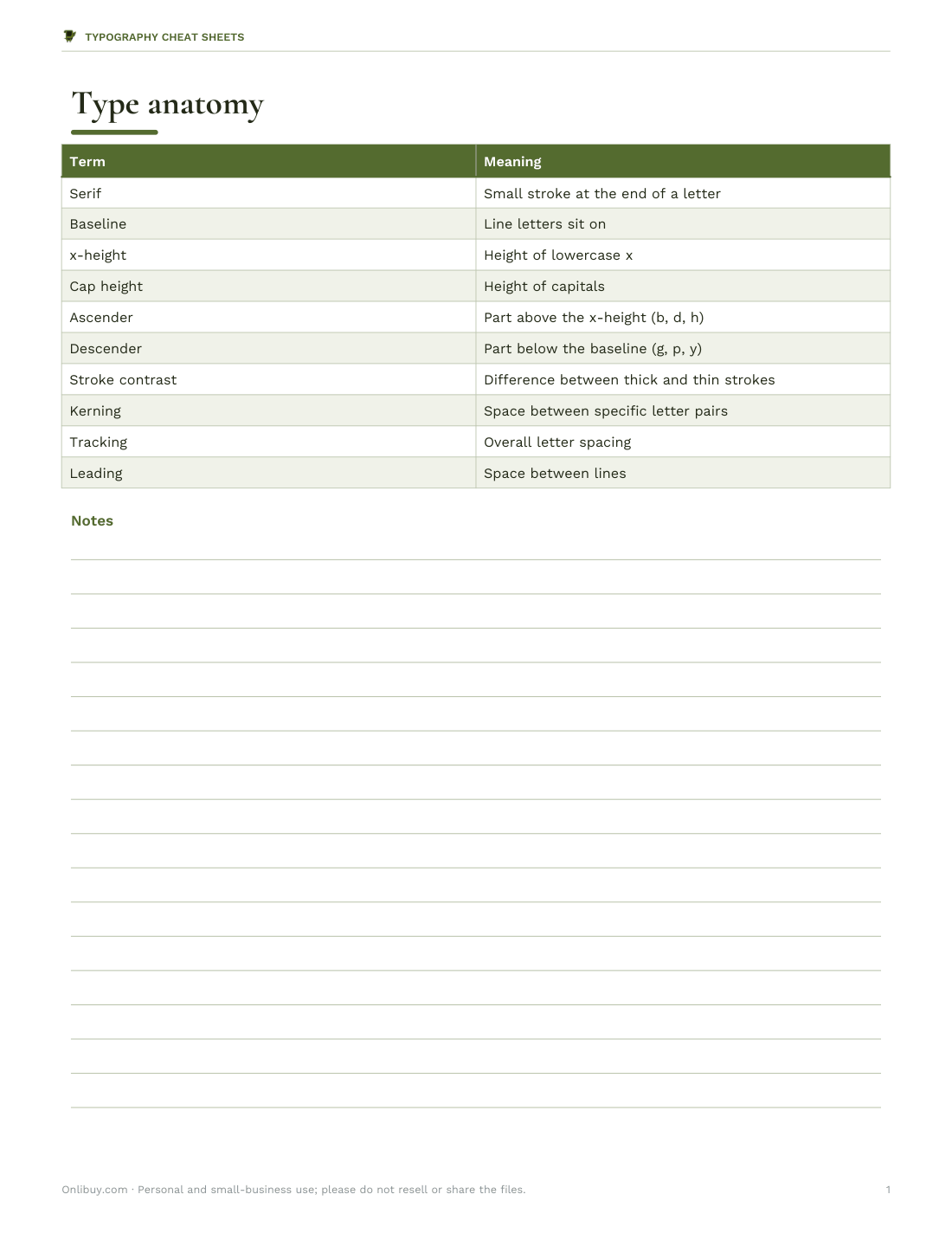
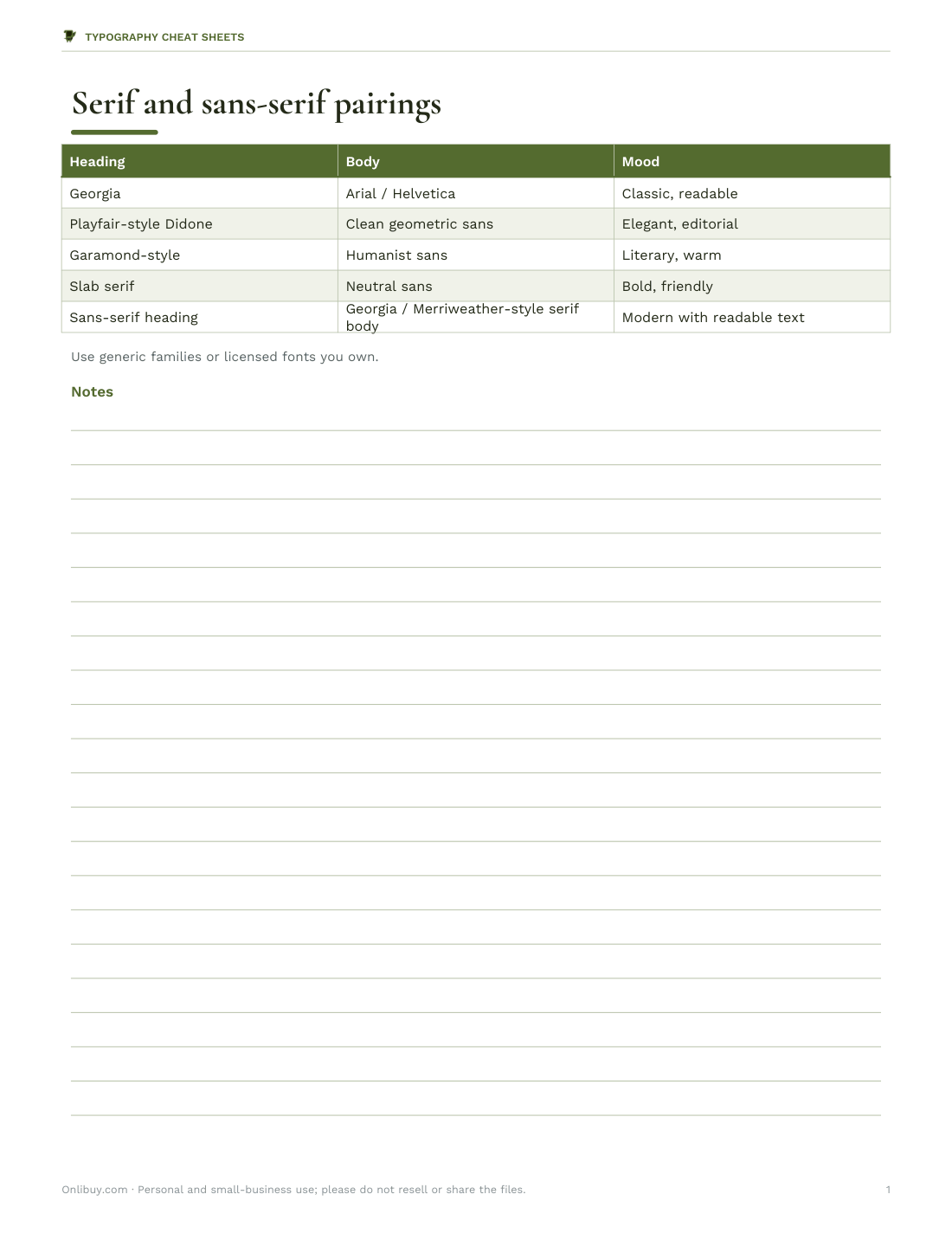
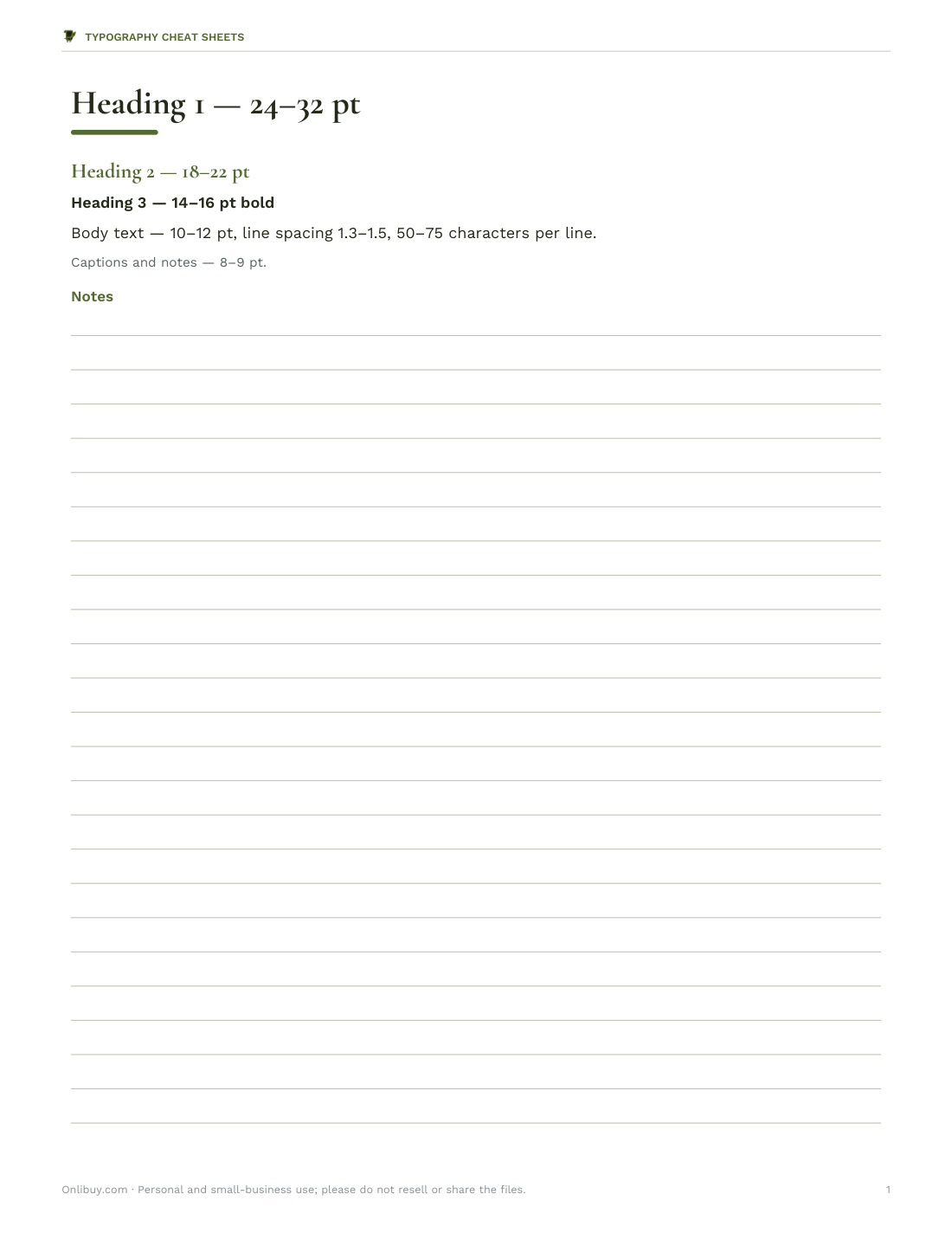
Printable type anatomy poster, a serif and sans-serif pairing guide, a heading hierarchy template for documents and a font choice worksheet.
- Type anatomy (PDF)
- Pairing guide (PDF/XLSX)
- Hierarchy template (DOCX/PDF)
- Font worksheet (DOCX/PDF)
Formats: PDF, XLSX, DOCX. Instant download after payment (link valid 72 hours, up to 5 downloads). AI-assisted: the templates were drafted with AI help and reviewed and laid out before publishing.
$5.00 USD, one-time 4 files · about $1.25 each
- Instant download
- 7-day refund
- Secure checkout by Stripe
7-day money-back guarantee. Full refund within 7 days of purchase, even after you download.
Free sample: Type Anatomy (PDF, 59 KB)
Full refund within 7 days — see the refund policy and license.
Free printables
Single sheets you can print right now, no sign-up. The full pack adds every sheet in one download plus the editable files.
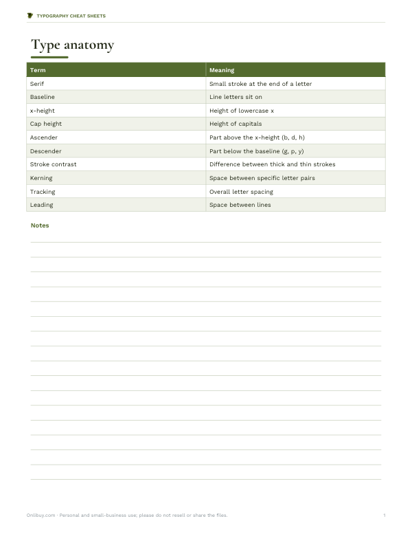 Printable Type Anatomy Chart
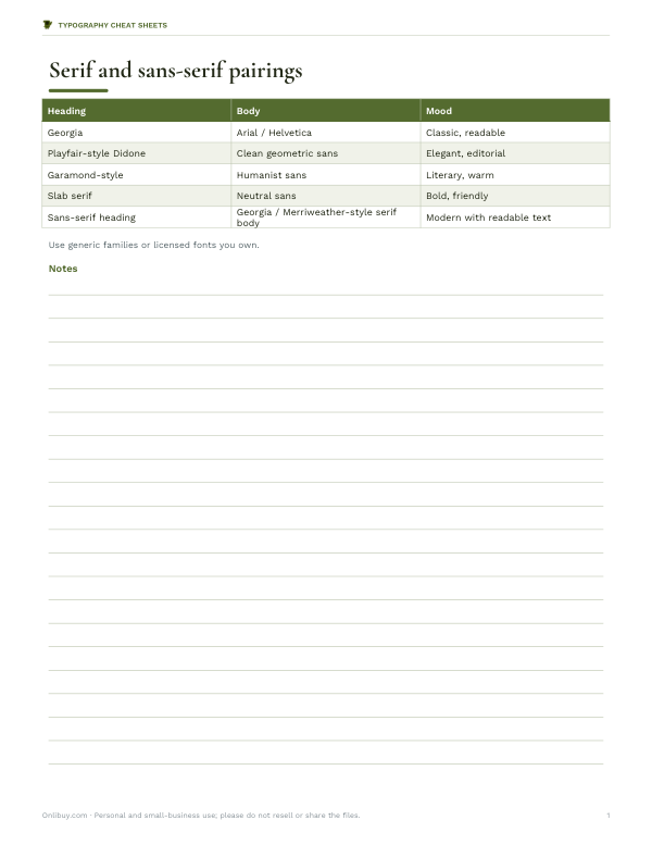 Printable Serif Font Pairing Guide
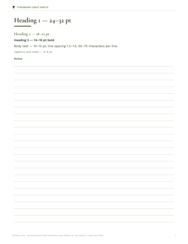 Printable Typography Hierarchy Template
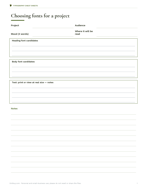 Printable Font Worksheet
What is a serif?
Serifs are the small strokes at the ends of letters — the little feet on a Times New Roman “T” or “n”. Serif typefaces such as Garamond, Georgia and Times feel traditional, literary and formal; sans-serif typefaces such as Arial and Helvetica feel clean and modern. Many books, newspapers and formal documents use serif type for body text, while screens and signage often favour sans-serif.
How the generator works
The Unicode standard includes complete alphabets originally intended for mathematics: bold, italic and bold-italic serif letters, double-struck letters and more. Because they are separate characters rather than font styling, they keep their appearance when pasted into places that only accept plain text — social bios, usernames, captions and messages. The generator swaps each ordinary letter and digit for its styled counterpart.
Styles available
| Style | Example | Notes |
|---|---|---|
| Serif bold | 𝐇𝐞𝐥𝐥𝐨 𝟐𝟎𝟐𝟔 | Letters and digits |
| Serif italic | 𝐻𝑒𝑙𝑙𝑜 | Letters only; digits stay plain |
| Serif bold italic | 𝑯𝒆𝒍𝒍𝒐 | Letters; digits use bold |
| Double-struck | ℍ𝕖𝕝𝕝𝕠 𝟚𝟘𝟚𝟞 | The outline style used for number sets in maths |
| Small caps (approximate) | ʜᴇʟʟᴏ | Built from phonetic letters; not every letter has a perfect match |
Accessibility and search: use with care
- Screen readers may read styled letters as “mathematical bold capital H” or skip them — people using assistive technology may not understand your text.
- Search engines and in-app search may not match styled text to normal words.
- Some older devices show empty boxes instead of these characters.
- Use styled letters for a word or two of emphasis, not whole sentences, and never for important information like names, links or instructions.
Worked example
For a bakery’s Instagram bio, “Fresh sourdough daily” works well as plain text for search, with a small styled touch: 𝐍𝐨𝐫𝐭𝐡𝐟𝐢𝐞𝐥𝐝 𝐁𝐚𝐤𝐞𝐫𝐲 · Fresh sourdough daily. The styled name stands out visually, while the description stays readable to screen readers and searchable.
Serif fonts for design and documents
| Typeface | Character | Good for |
|---|---|---|
| Georgia | Designed for screens; sturdy and readable | Websites, emails, body text |
| Times New Roman | Compact and familiar | Academic papers, formal documents |
| Garamond | Elegant, classical | Books, invitations, literary design |
| Palatino | Calligraphic, open | Reports, headings, menus |
| Baskerville | Crisp, high contrast | Headlines, certificates |
| Didot / Bodoni | Very high contrast | Fashion and luxury headlines |
The preview shows your text in serif fonts available on your device. In documents and designs, choose a real typeface rather than Unicode styled letters.
Where Unicode styled text works
| Place | Works? | Tip |
|---|---|---|
| Instagram / TikTok bios | Usually | Keep keywords in plain text for search |
| X / Threads posts | Usually | Avoid styling hashtags — they may stop working |
| Usernames and handles | Often not allowed | Platforms restrict handle characters |
| Email subject lines | Sometimes | May be flagged or shown as boxes |
| Documents and websites | Avoid | Use real fonts and CSS instead |
| Product listings | Avoid | Breaks search and may break platform rules |
Readability tips for serif text
Serif typefaces read comfortably in long passages when set at a generous size with enough line spacing — around 1.4 to 1.6 times the font size on screens. Avoid very thin, high-contrast serifs for small text on low-resolution screens, where the fine strokes can break up. For headings, high-contrast serifs look striking; for body text, sturdier faces with larger x-heights are easier to read.
Serif styles compared
| Style | Features | Examples |
|---|---|---|
| Old-style | Low contrast, angled stress, bracketed serifs | Garamond, Bembo |
| Transitional | More contrast, vertical stress | Baskerville, Times |
| Didone (modern) | Very high contrast, thin flat serifs | Bodoni, Didot |
| Slab serif | Thick, block-like serifs, low contrast | Rockwell, Courier |
| Glyphic | Carved, flared strokes | Albertus, Trajan-style caps |
A short history of serifs
Serifs trace back to Roman inscriptions carved in stone, where the chisel’s finishing strokes gave letters crisp ends. Printers adopted serif letterforms for books from the fifteenth century onwards, and styles evolved from old-style faces like Garamond to transitional faces like Baskerville and high-contrast modern faces like Bodoni and Didot. Sans-serif type became common in the nineteenth and twentieth centuries for signage and advertising.
Pairing serif and sans-serif
- Use a serif for headings and a sans-serif for body text (or the reverse) for clear contrast.
- Pick typefaces with similar proportions so they look like a family.
- Limit a design to two typefaces, using weights and sizes for variety.
- Check legibility at small sizes, especially on screens.
Typography cheat sheets
The optional pack includes a printable type anatomy poster, a serif and sans-serif pairing guide, a heading hierarchy template for documents and a font choice worksheet. The generator above is free.
AI-assisted content
This page was drafted with AI assistance and reviewed before publishing. Typeface names are trademarks of their respective owners; the preview uses fonts installed on your device.
Frequently asked questions
How do I get serif font in my Instagram bio?
Convert your text here and paste the styled Unicode characters into your bio.
Are these real fonts?
No, they are Unicode characters that look like serif bold or italic letters.
Why do some letters show as boxes?
The device or app lacks a font that includes those characters.
Can screen readers read styled text?
Often poorly — they may read it as maths symbols; use it sparingly.
What is the difference between serif and sans-serif?
Serif letters have small finishing strokes; sans-serif letters do not.
Is my text uploaded?
No, conversion happens in your browser.
Will styled text hurt my SEO?
Search engines may not match styled characters to normal words, so keep important keywords in plain text.
Can I use serif styles in Word or Google Docs?
Yes, but it is better to choose a real serif font there, such as Georgia or Times New Roman.